Checkout Usability
Part of Payment method selection
Showing payment options without cluttering checkout
Present payment choices with clear labels, eligible wallet buttons, concise instructions and accessible controls.
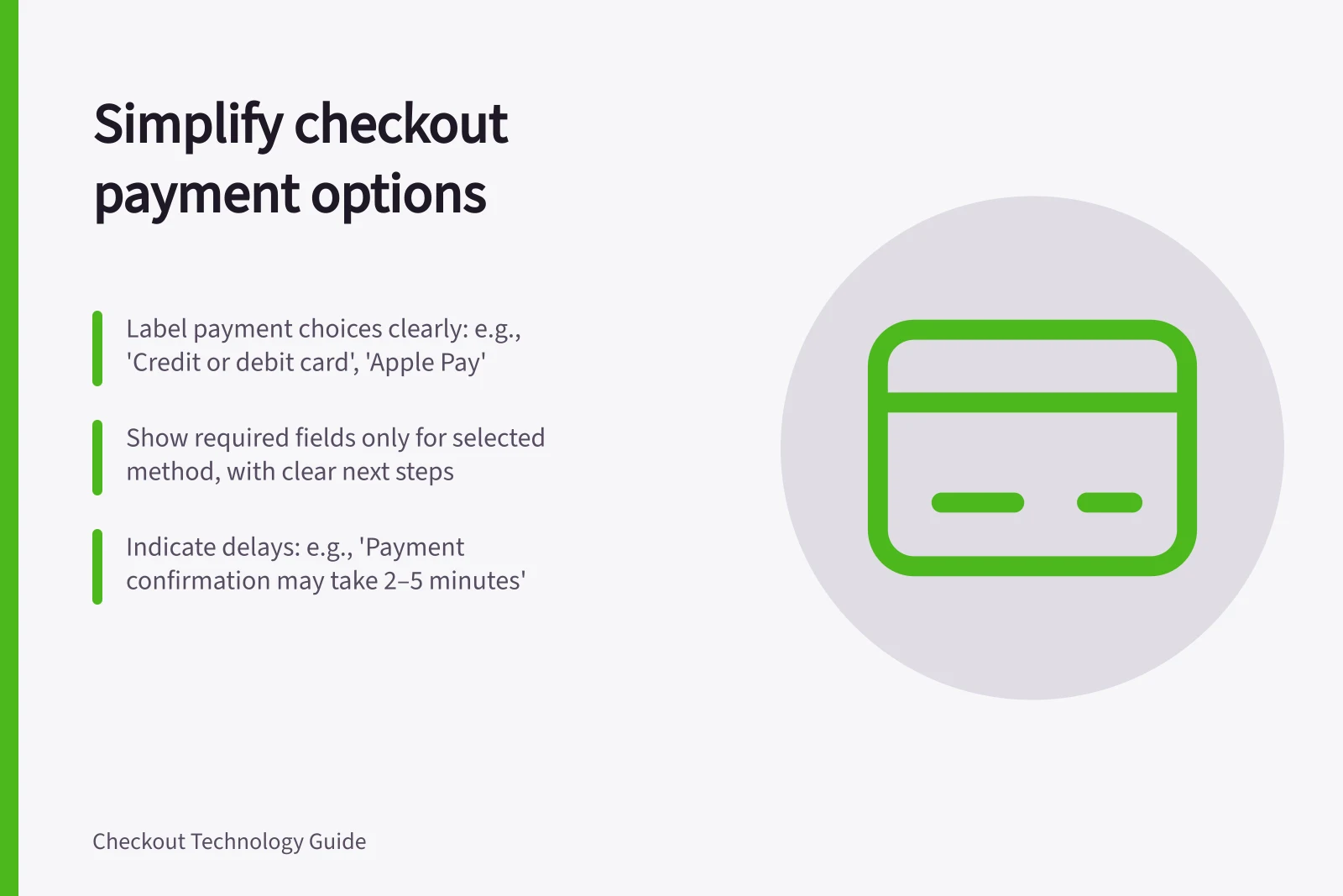
Show payment choices where shoppers decide how to pay. Give each option a recognisable name and enough information to understand the next action. Put fields and longer instructions with the selected option, and make any material delay clear before the shopper commits.
Make the choices easy to scan
Label the group “How would you like to pay?” and use concise option labels such as “Credit or debit card”, “Apple Pay” or “PayTo”. Make the text understandable even without a brand mark. If a route sends the shopper to online banking, or the order waits for payment confirmation, say so beside that choice.
An express wallet button may appear earlier in the journey. At the payment step, avoid repeated buttons that appear to start the same action. Keep the selected delivery choice available for review before the final payment action.
Payment Method Labels: Clear vs. Confusing Examples
- Clear Label
- PayTo – Review and authorise payment in your bank app
- Confusing Label
- Bank Pay – Complete transaction via online banking
Show methods the integration supports
If your e-commerce platform or payment service provider (PSP) supports Apple Pay, it can simplify and shorten your integration effort. Google Pay documents a readiness check and a payment sheet for supported saved methods.
Use the actual integration’s availability controls, and provide another supported route where possible. A static logo cannot establish that the shopper can complete a wallet payment.
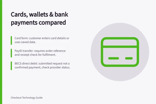
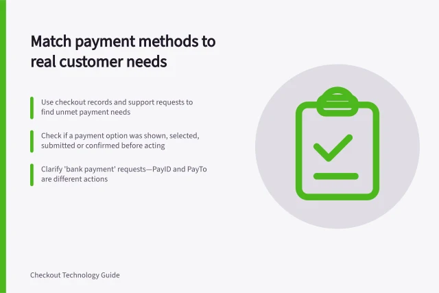
Name bank routes by the action involved. For a PayID transfer, the customer initiates a payment through online banking. With PayTo, the customer reviews and authorises an agreement there. A generic “bank pay” label can conceal that difference.
Key Payment Integration Support Features
- Apple Pay Integration
- Simplifies checkout; supports one-tap payments on iOS devices
- Google Pay Integration
- Uses payment sheet for saved methods; includes readiness checks
- PayID & PayTo Support
- Enables fast, secure transfers using a mobile number or email
Reveal the detail that belongs to each choice
Show card fields with the card choice. For PayTo, explain the agreement and how the shopper will learn the payment outcome.
For a customer-initiated transfer, give the payment details and order reference the store’s process requires, and explain when the order can proceed. A processing message must not imply that an unconfirmed payment has succeeded.
If selecting a method changes the amount payable, show the revised amount before payment. Preserve a clear way back to the choices if a wallet sheet closes, a banking step is cancelled or the shopper needs another method.
Customer Journey for PayTo Payment
- Select PayTo at checkout
- Redirected to your bank’s app or website
- Review agreement and authorise payment
- Return to merchant site with confirmation
Use understandable controls and errors
Use labelled controls for the choice. Where the options are radio buttons, W3C guidance calls for grouping them with a fieldset and legend in the page code and presenting the group clearly. Each label should still make sense on its own.
If an input error is detected, identify the affected item. Describe the error in text, rather than relying on colour or an icon.
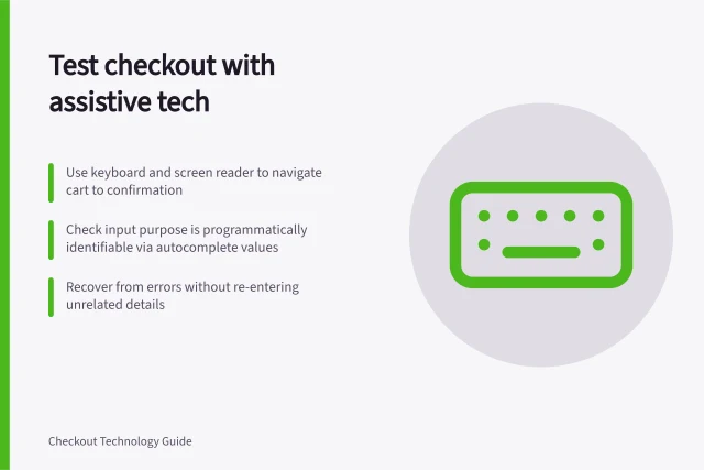
Before release, review the offered routes at a narrow screen width and with keyboard and screen-reader navigation using the platform’s permitted setup. Include selection, cancellation and return. Record any point where the label, amount or next action becomes unclear.
Accessibility & Usability Best Practices for Payment Options
- Group radio buttons using fieldset and legend
- Use clear, standalone labels for each option
- Display error messages in text, not just icons or colour
- Test with keyboard navigation and screen readers